

BRANDING • LAYOUT DESIGN • DESIGN SYSTEMS • GRAPHIC DESIGN
I was integral to Tyson Foods, Inc.’s re-branding of its consumer-facing corporate identity. My role encompassed the development of brand guidelines, positioning, and the dissemination of design systems across the enterprise. Collaboration with the creative strategist involved shaping tone and voice, guiding photography and image direction, formulating signage guidelines, establishing color usage, and creating employment ads, among other responsibilities.
Client
Tyson Foods, Inc.
Year
2017-19
Role
Art Director + Designer
Industry
FMCG, CPG


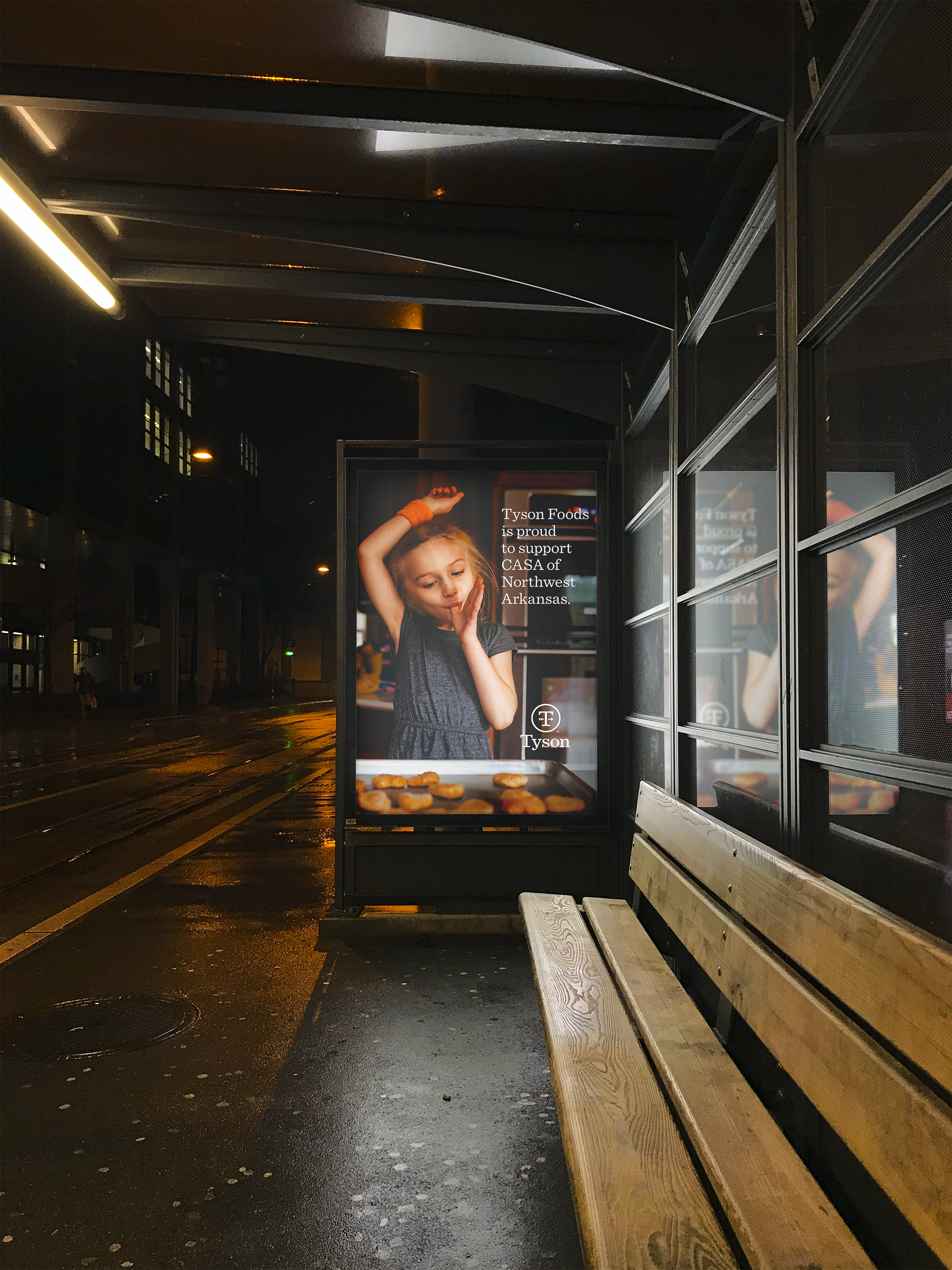


Two noteworthy contributions included the selection and explanation of photography that defined the new corporate identity, along with defining the tone and voice - the personification of Tyson Foods. These elements, comprising carefully chosen images, words, and definitions, served as the foundation for the Tyson Foods, Inc. brand.
Additionally, the launch of a new corporate identity necessitated the development of design systems. I played a pivotal role in creating icon collections for diverse applications, such as employee systems with Workday and safety icons for plants. This small collection demonstrated the meticulous development and consistent implementation of icons throughout the enterprise.
The project delivered an exceptionally detailed set of brand guidelines, ensuring precision in directing internal and external partners, guiding future collaborations, and maintaining consistency in adopting new brand standards across the corporation. This comprehensive framework facilitated the swift development of design systems, icons, ad campaigns, and more, strategically aligned with the brand’s launch.
Outcomes